— Project name:
Peer CITM
— Roles:
UX & UI Designer
— Date:
May 2018
This project aimed to design the UX and UI of a platform to perform peer assessment methods in class at the Centre de la Imatge I Tecnología Multimedia in Barcelona.
Peer assessment(PA) is an academic and evaluative practice that consist in, roughly, allowing students to evaluate each other’s work. This project designed an advanced prototype of a website and a mobile application with simulated functionality using Axure RP.


Process
Research
Objectives:
1. To obtain information about user’s characteristics regarding: demographics values, behaviour, attitude and goals.
2. To identify which methods of peer assessment will teachers use in their courses.
3. To determine the functionalities teachers and students believe each platform(website/application) should offer and which of them are more relevant to their needs.
4. To define the different contexts in which users will use the platform.
5. To describe the way teachers will use the data they’ll collect from the peer grading methods and how they would want it to be represented.
Interviews
The interviews were the first contact with potential users of the website and application to be designed. Because of this, I tailored an interview format that could facilitate interviewees to give open opinions and thoughts about the project freely.
Some Q’s:
What functionalities you consider the PA platform should offer to properly help teachers implement PA into their classes?
Will you allow students to work on PA assignments during class or will they be supposed to be completed as homework?
Regarding the results you get from a PA assignment, what information would you like to be shown?

Personas
These were used to create a reliable and realistic representation of the audience this project designs for.
In this case, it was found that the majority of the potential users were going to be men with interest in the technologic sector. This stems as a consequence of the lack of women’s representation in these type of industries.

Design
User flows
The first step to design the Information Architecture of the platform was to define which were the core functionalities it should offer. In order to achieve this early in the process, I elaborated some tasks flows to show an initial idea to the client. Once these functionalities were agreed, I proceeded to work on more elaborated user flows, some which are shown in these images.


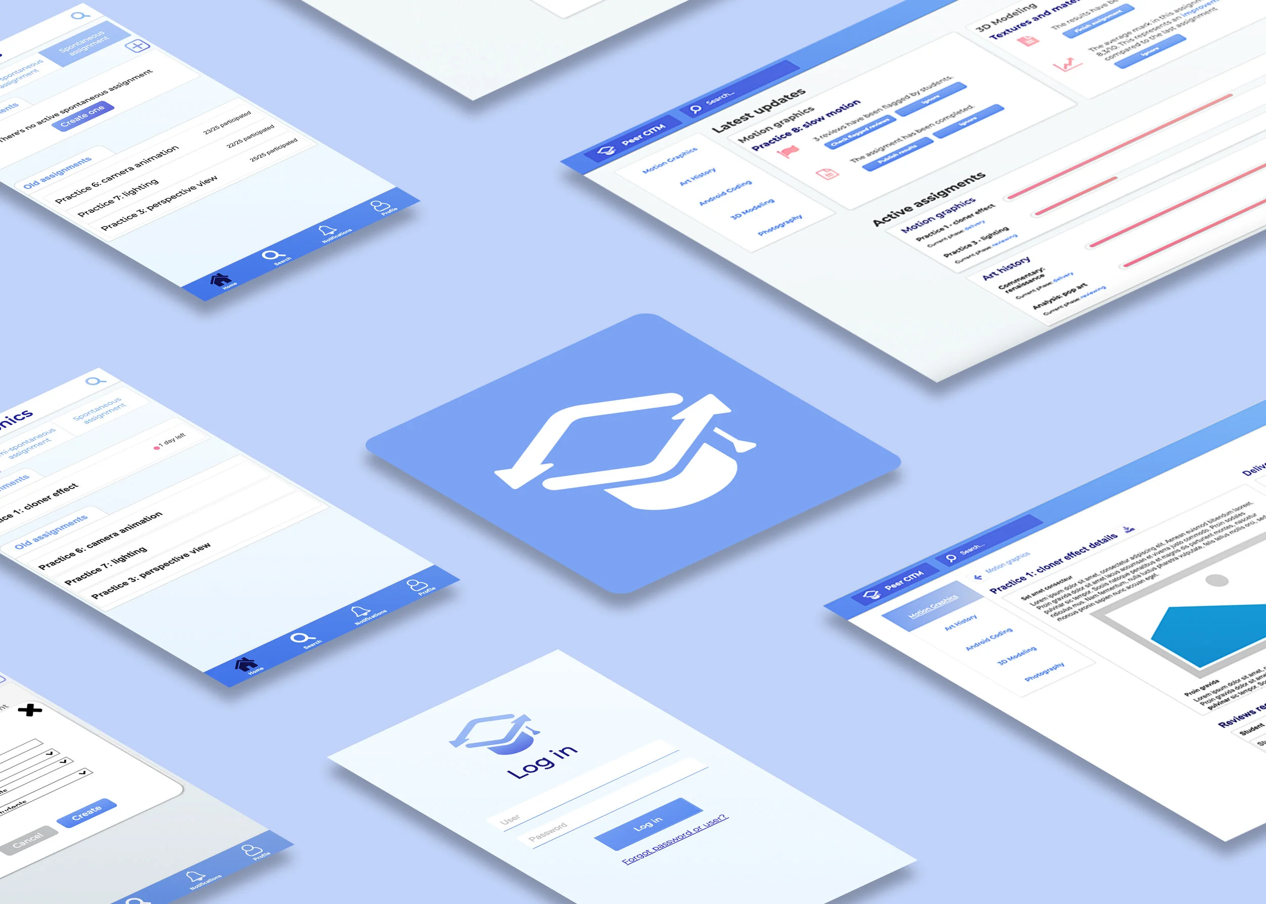
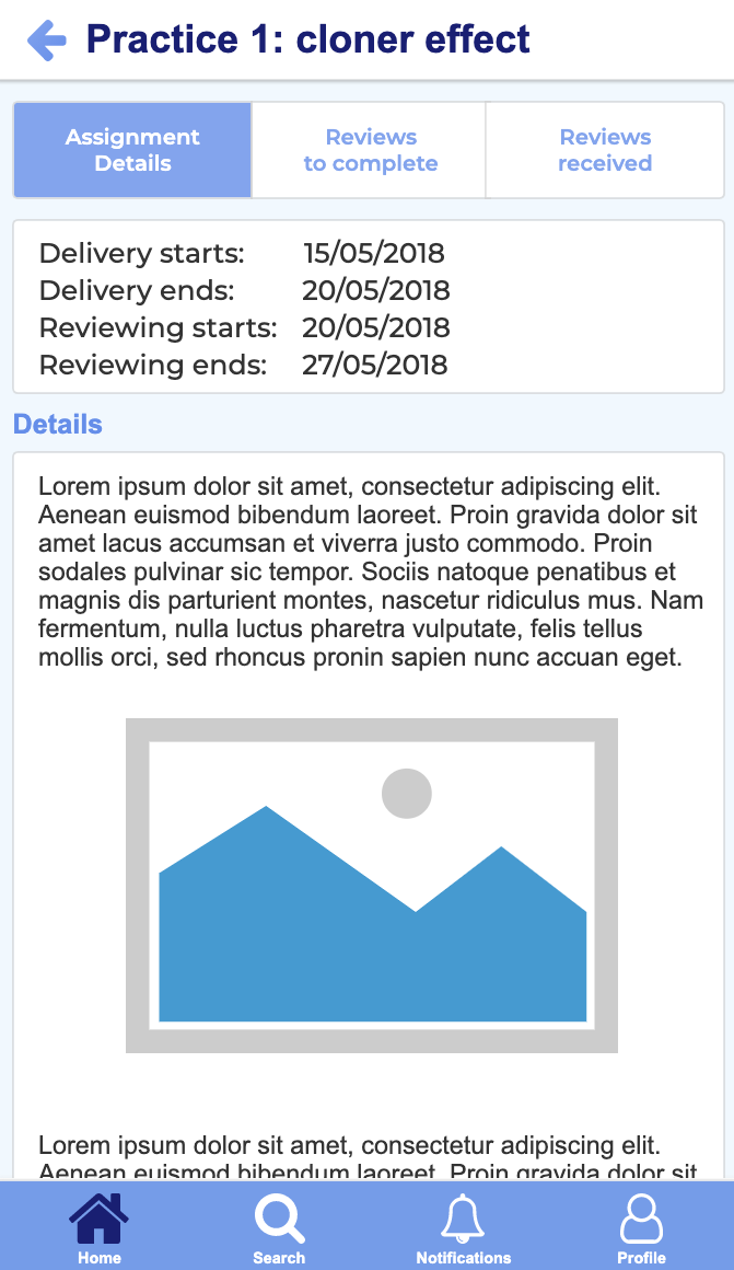
Wireframes
This wireframe was produced based on the user flows shown previously. Two versions of the platform had to be designed, one for teachers and one for students, both with simulated functionality. The formers would act not only as users but also as managers of their own classes and assignments in the platform, whereas the later would have access to a version with different functionalities.

Testing


This was the second time a wireframe was going to be used by users, so this test went into deeper tasks of the platform concerning the information architecture designed. As the project was modest in resources, qualitative data was preferred over quantitative.
The use test aimed to:
Check the IA proposed is correct and easy to understand for users.
Verify that the way content and icons shown in the interfaces do not generate
confusion.Test that the main functionalities that the platform offers (designed following the path
of the user flows) can be executed efficiently by users.Check if users understand the meaning and the function of the interactive buttons.